Condition
The Condition section illustrates the current condition of the most critical components and offers estimations on their remaining service life. You can use the data to plan and schedule preventive maintenance actions, which helps you reduce unplanned downtime and improve safety. You can also use this section to follow up the replacement frequency of the components. Replacement frequency provides an indication of upcoming maintenance needs and reveals how changes in the actions of crane operators affect the service life of the components.
The condition graphs are based on estimating the remaining theoretical service life of critical components. Two types of graphs appear frequently.
- Pie graphs that present the estimated remaining service life of the component at the end of the selected time frame
- Trend graphs that present the service life trend from the selected time frame
Pie graphs
Each machinery or component has a pie graph of its own.
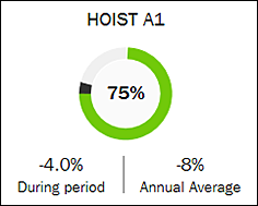
The pie graphs indicate the estimated remaining service life with a percentage and a traffic light. The logic behind the traffic lights is as follows:
| Status color | Explanation | Recommendation |
|---|---|---|
 | More than 30% of estimated service life left | You can continue using the crane normally. All statutory inspections and regular maintenance actions are still necessary. |
 | 10% to 30% of estimated service life left | Review the estimated remaining service life. Inspect the machinery or component. Start planning maintenance actions or an investment. |
 | Less than 10% of estimated service life left | Carry out the maintenance actions or realize the investment. |
The black portions in the graphs indicate the change that occurred during the selected time frame. So, the black and gray portions together make up the service life percentage that was consumed by the end of the selected time frame.
Below the graph, two percentages are presented: change in the estimated remaining service life percentage during the selected time frame and average annual change. Usually the change is negative (such as -4.0% in the above example), referring to a reduction in the service life owing to usage. But, the change can also be positive, meaning that the machinery component was changed or overhauled during the selected time frame.
Trend graphs
The trend graphs present all machineries or components of the selected crane. Each machinery or component has a trend line color of its own. The values are estimates that are based on the usage history of the machinery or component.
The horizontal x-axis presents time and the vertical y-axis presents the estimated remaining service life percentage. The black vertical line marks the current point of time.
The meaning of the two horizontal lines is as follows.
- Yellow line: Warning level, less than 30% of estimated service life left
- Red line: Alert level, less than 10% of estimated service life left
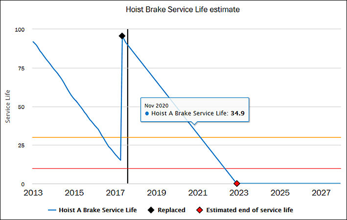
If there is a small black square in the graph, it marks the point of time when the machinery or component was replaced. The service life calculation of the machinery or component starts over at that point. The red square signifies the point of time when the machinery or component is estimated to reach the end of its service life.
To see more information about a particular part of a graph, move your mouse cursor over that part. A box showing detailed values for that part of the graph appears.
By clicking a machinery or component name below the graph, you can hide the trend line of that machinery or component. The name turns gray. To bring back the machinery or component, click again.